After months of hard work, edits, more hard work, more edits (rinse and repeat 10x), we’ve officially launched our NEW Fetch website, unveiling along with it, a new brand identity.
When I started as the Art Director for Fetch in 2019, there was a clear objective as to what needed to be accomplished. Branding. Now, branding tends to be one of those “trendy” words every company talks about, understands they need, but isn’t completely sure what it fully encompasses. If you ask most people, they’ll tell you branding is a consistent visual representation of the company or they might tell you it’s the logo. They’re not wrong. But it’s honestly deeper than that. A lot deeper.
I like to think of the identity of a person as an example. Are they defined by the clothes they’re wearing? The way they style their hair? The shoes they wear? That’s the visual expression they’re presenting to the world. But their identity comes from within. It’s their mission, their beliefs, their values, their “WHY.” (There’s the buzz word…)
Just like people, a company is a living, breathing, organism. We’re complicated, we’re built in layers and we have depth beyond belief. Our visual representation, our design we display to the world, is just a piece of the overall puzzle. Just a small piece that allows people to connect with us. But what fully builds the bridge for a trusting relationship between consumer and company, is that “depth-beyond-belief” part. To create successful branding, you must start with your “WHY” and from there…Build Every. Single. Piece. authentically and intentionally around it.
Which is exactly what we did at Fetch.
As it is in most startup cultures, starting out as toddlers, branding just needs to be functional. This normally results in a lot of piecemeal collateral, several different logo versions, mixed messaging, and in our case, a lot of questions from people asking if we were a dog walking company. Our company is now 4 years old (and if you haven’t heard yet, at Fetch we work in dog years, which technically makes us almost 30) so it was indeed time to find our “why” and show the world who we truly are. And to do so, we needed to start at the beginning.
The first part of our process, I call “soul searching.” We started with digging into the core of our company, asking questions like: what do we believe, what true benefit are we providing, how are we unique and how do we want to make our customers feel? From there, we were organically finding that at Fetch, we see package delivery as so much more than just an ordinary service. We truly believe in the idea of spreading joy through package delivery moments and providing above and beyond customer care.
Thus, Delivery Drives Us was born. Our new tagline that formed from our soul searching exploration could not embody Fetch more. It is the reason why we get up and do what we do every single day. At Fetch, a package is more than just a box. Now more than ever, we understand the essentials that need to be delivered, the new hobbies people are trying to embrace, the activities stay at home parents are creatively coming up with. Each package is as important as the person receiving it. And that’s what keeps driving us forward.
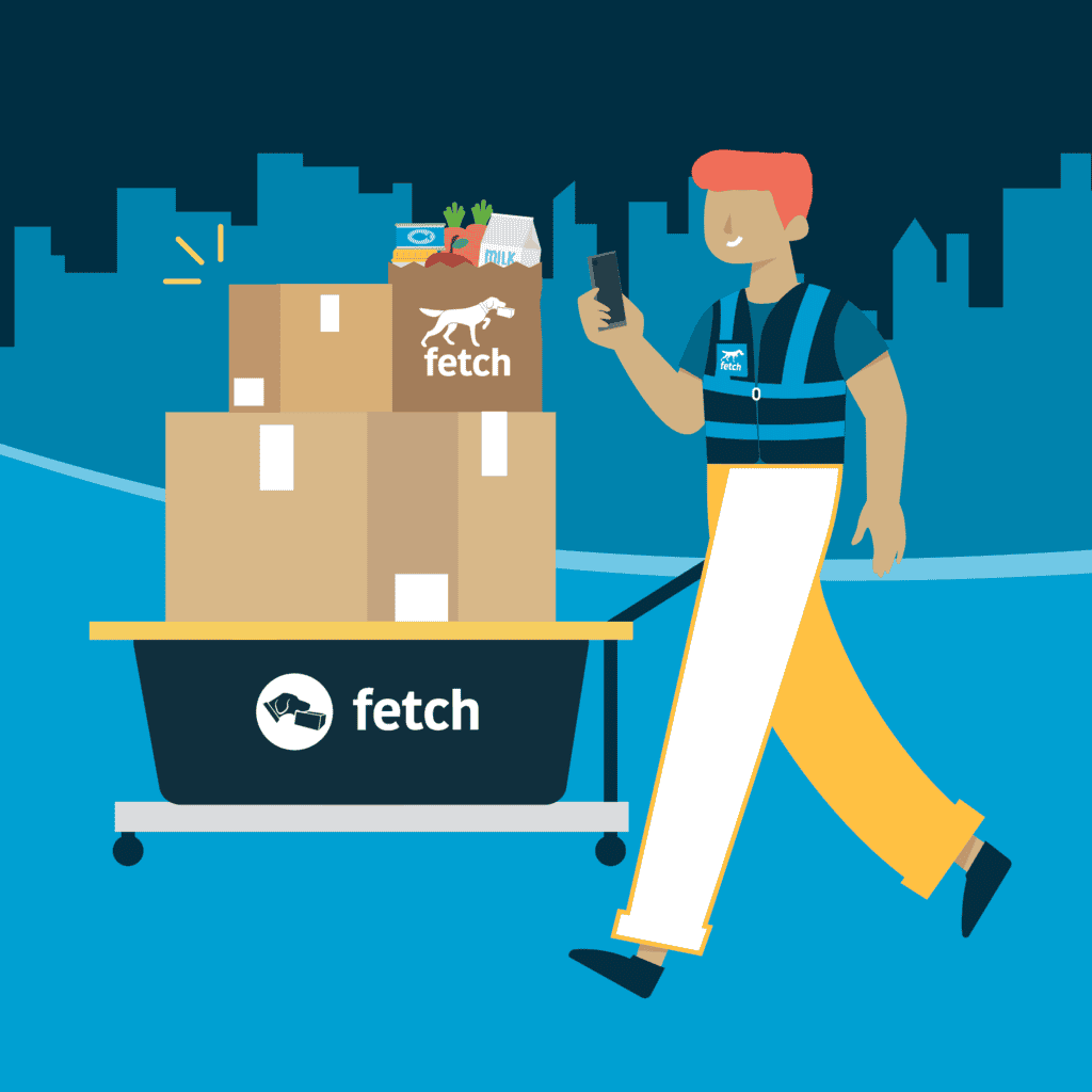
At last, we started building out the creative. Knowing that Fetch is a unique, “out of the box” solution, we knew the creative needed to also feel unique and just a bit disruptive. Being the only package management solution that does what we do, the world was wide open as to how we could express ourselves. One word we kept coming back to was SIMPLE. Our solution is to simplify the lives of our consumers, so everything we were doing, from our design to our voice, needed to convey simplicity. This is where the idea of simple line illustrations was born and what really drove the main look and feel of the designs.
The other word that collectively kept surfacing was JOY. As a company that is built by humans for humans, we empathize with every single customer. From our property management partners to the individual resident who is frustrated by lost and missing packages. Internally, our deep care for helping others and creating joyful moments through seamless package delivery bleeds through our entire company (re: fetch has an incredible culture blog) and now we just needed to share that passion externally.
Joy is often found in the unexpected. We introduced playful elements of transportation into our designs like a small hot air balloon or a sailboat that hinted at how above and beyond our team would go to deliver our customers their items and ultimately made you smile. No, we haven’t had to hire out a balloon yet, but if we do I’m totally in.
Finally, we knew that transportation and logistics play a huge part in how we “fetch” things, so we needed to have components that conveyed a sense of movement and getting things from point A to point B. The dotted lines allowed us to play with connecting elements and added a final touch of playfulness.
And there we have it. Naturally, there was much more that went into it than just what I’ve shared. Sleepless nights and long days of tweaking and sharing and re-envisioning and colors and fonts and version number 52. And we’ve passed the true test for a brand. Our end product is something that our entire company stands proudly behind and shares with enthusiasm. When the entirety of your company gets even more excited to work for their company because the brand resonates and means something to them, that’s when you know it was a success.


